% of homes built before 1911
Frome's property market tells a fascinating story when you look at it through the lens of housing age.
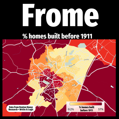
This map shows the percentage of homes in each part of Frome that were built before 1911. It offers a revealing glimpse into how the town developed over the last century and more.
The colours range from grey to deep red. Grey indicates areas where no homes existed before 1911. As the colour shifts from yellow through orange to deep red, the percentage of older housing increases. In other words, the redder the area, the more pre -1911 homes it contains.
The map is divided into small geographic units known as Output Areas. These are statistical boundaries of between 100 and 250 households used in national UK data reporting. Every bit of land is assigned to one, even if there are no homes on it. So, if you see a coloured area with no houses, it’s not a mistake – it simply means that patch of land is included in the dataset, even if it's a park, field or industrial estate.
Understanding the age profile of the local Frome housing market is key when advising buyers and sellers. Some people are drawn to the charm and character of older homes, while others value the practicality and lower maintenance of newer builds.
As an estate agent in Frome, I make it my business to understand these nuances. It’s this local insight that helps me guide people towards the right home for them.


