Latest Property News
- Details
- Hits: 481
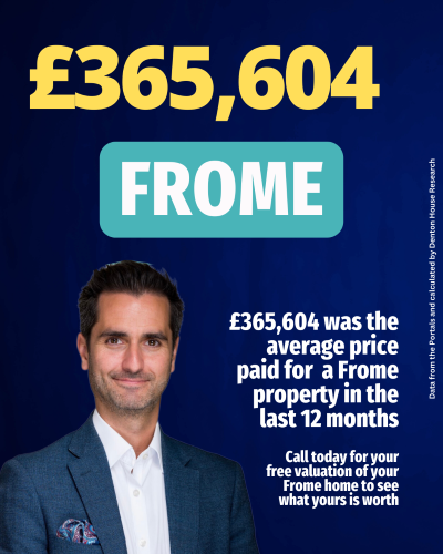
Frome House Price Review: February 2026
Frome homeowner or landlord? Curious about the trends in Frome's property market?
One measure is the average price paid for homes bought and sold in Frome in the last 12 months, on a rolling month by month basis.
Each month I like to share this figure, and whilst this figure alone will not tell you much, its trend will.
- Details
- Hits: 528
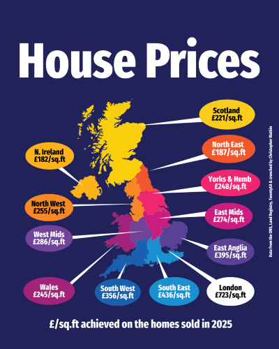
The Alternative Measure of UK House Prices You Rarely See
We are all used to hearing about the average house price. It is the headline figure quoted in the press and the one most people reference in conversation. Yet average price only tells part of the story.
Another way to look at the market is through the price achieved per square foot. Rather than focusing on what a home sold for overall, it looks at how much buyers are willing to pay for the space itself. In a country where we still think in feet and inches, pounds per square foot offers a simple way to compare value between regions.
- Details
- Hits: 472
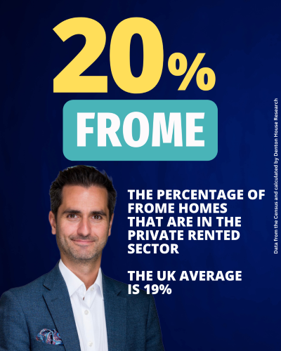
% Private Rented in Frome
Walk down almost any street in the UK and one thing is quietly changing the shape of our communities.
The private rental sector is growing, and it now plays a far bigger role than many people realise.
- Details
- Hits: 730
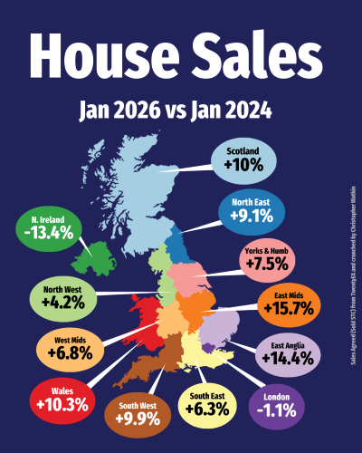
UK House Sales. January 2026 vs January 2024. A market quietly gathering pace.
If you strip out the noise and look purely at sales agreed, January 2026 is telling a far more constructive story than many expected.
Across much of the UK, buyer activity is not just holding up, it is materially stronger than two years ago. This is not a market being dragged along by incentives or deadlines. It is a market being powered by people who have decided that moving home can no longer be put on hold.
- Details
- Hits: 636
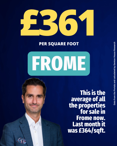
£ per square foot February 2026
Welcome back to news of Frome's property market, where each week I bring you different local property market stats and trends. This week I am back again with the February's £/sq.ft statistics.
The average property presently in Frome is on the market for £361 per square foot, a figure representing the current heartbeat of Frome's property market.
Last month it was £364 per square foot.


